

For a finished leather piece, the first thing that immediately catches our eye is its color; the right color palette can add a lot of points. Therefore, leather color matching should be a question that leather craftsmen must rack their brains and carefully consider after delving into leatherworking.
If leather craft techniques can be practiced, color matching is the result of personal taste and continuous learning, requiring long-term immersion in a certain environment to shine. If you can’t quickly get inspiration for leather color combinations, you’ll need to think daily and practice to gradually get the hang of it.
Today, I’ll share a few commonly used color matching tips to give you some ideas for your leather goods color matching, so you won’t just mix and match randomly when making leather goods, or even lose your sense of where to start.
Monochrome impression
Monochrome or single color doesn’t require worrying about color matching. Let’s start with some common color schemes that make a first impression. Once you have a basic understanding of the tone of leather colors, you can better recommend leather options to customers based on their needs.
1. Red
![Image [1]-Basic Leather Color Matching Tips to Create Stunning High-Quality Leather Goods-Nleather](https://www.nleather.com/wp-content/uploads/2026/06/v2-b5c32a118b2be0f4412c2fda484b963e_1440w.webp "v2-b5c32a118b2be0f4412c2fda484b963e_1440w – Nleather")
The most eye-catching and noteworthy colors have a strong appeal. Symbolizes enthusiasm, celebration, and happiness; On the other hand, it also symbolizes alertness to danger and intense sexual stimulation.
2. Orange
![Image [2]-Basic Leather Color Matching Tips to Create Stunning High-Quality Leather Goods-Nleather](https://www.nleather.com/wp-content/uploads/2026/06/v2-d9c45b5a9623577785bfc4bdcb493bdf_1440w.webp "v2-d9c45b5a9623577785bfc4bdcb493bdf_1440w – Nleather")
The colors harvested in autumn, bright orange are warmer and more gorgeous than red, and are the warmest of all colors. It symbolizes happiness, health, and courage.
3. Yellow
![Image [3]-Basic Leather Color Matching Tips to Create Stunning High-Quality Leather Goods-Nleather](https://www.nleather.com/wp-content/uploads/2026/06/v2-bf1d25843654f5e8c26d5355459778cb_1440w.webp "v2-bf1d25843654f5e8c26d5355459778cb_1440w – Nleather")
Lighthearted, cheerful, full of hope and vitality, it is the warmest of many colors. It gives a light, brilliant, warm, and hopeful color impression.
4. Green
![Image [4]-Basic Leather Color Matching Tips to Create Stunning High-Quality Leather Goods-Nleather](https://www.nleather.com/wp-content/uploads/2026/06/v2-d074f65a8f69d6f87622c0c4e4012e43_1440w.webp "v2-d074f65a8f69d6f87622c0c4e4012e43_1440w – Nleather")
Fresh, hopeful, safe, calm, comfortable, life, peace, tranquility, nature, environmental protection, growth, vitality, youth, relaxation.
5. Blue
![Image [5]-Basic Leather Color Matching Tips to Create Stunning High-Quality Leather Goods-Nleather](https://www.nleather.com/wp-content/uploads/2026/06/v2-816bb91f8ce1b0bdb70f4550b8f01f5a_1440w.png "v2-816bb91f8ce1b0bdb70f4550b8f01f5a_1440w – Nleather")
The coolest color in cool tones. It often brings to mind the ocean, sky, lake, and universe. It symbolizes purity, beauty, dreaminess, calmness, rationality, tranquility, and vastness.
6. Purple
![Image [6]-Basic Leather Color Matching Tips to Create Stunning High-Quality Leather Goods-Nleather](https://www.nleather.com/wp-content/uploads/2026/06/v2-c415a924c04e62d3e5610352c0d289a2_1440w.webp "v2-c415a924c04e62d3e5610352c0d289a2_1440w – Nleather")
Elegant, noble, charming, proud, cool, and impressive, representing prestige, depth, and elegance. It carries a slightly melancholic yet charming color, a color that is hard to forget.
7. Pink
![Image [7]-Basic Leather Color Matching Tips to Create Stunning High-Quality Leather Goods-Nleather](https://www.nleather.com/wp-content/uploads/2026/06/v2-0d5bb034e5d603ace051180a7ef86b9c_1440w.webp "v2-0d5bb034e5d603ace051180a7ef86b9c_1440w – Nleather")
Cute, sweet, gentle, innocent, youthful, innocent, innocent, romantic, bright, soft, and feminine elegant.
8. Black
![Image [8]-Basic Leather Color Matching Tips to Create Stunning High-Quality Leather Goods-Nleather](https://www.nleather.com/wp-content/uploads/2026/06/v2-add74a4ea54deb1aacecc57f31e44705_1440w.png "v2-add74a4ea54deb1aacecc57f31e44705_1440w – Nleather")
The deepest colors, very stable hues—mature, mysterious, elegant, confident, profound, and cool.
9. White
![Image [9]-Basic Leather Color Matching Tips to Create Stunning High-Quality Leather Goods-Nleather](https://www.nleather.com/wp-content/uploads/2026/06/v2-f756d69ad26e18499bfd987d34d59a0d_1440w.webp "v2-f756d69ad26e18499bfd987d34d59a0d_1440w – Nleather")
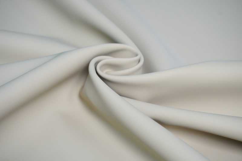
It evokes images of ice and snow, white clouds, and cotton, giving feelings of brightness, simplicity, innocence, lightness, tranquility, neatness, elegance, coolness, and hygiene, symbolizing peace and sanctity.
10. Gray
![Image [10]-Basic Leather Color Matching Tips to Create Stunning High-Quality Leather Goods-Nleather](https://www.nleather.com/wp-content/uploads/2026/06/v2-69d11cef56796c4efcff6629fe88f41d_1440w.webp "v2-69d11cef56796c4efcff6629fe88f41d_1440w – Nleather")
Achromatic means no hue or purity, only brightness. Confused, honest, honest, tough, stubborn, resolute, persistent, upright, and repressed.
Color Scheme Sharing
001 White + Crystal Pink
![Image [11]-Basic Leather Color Matching Tips to Create Stunning High-Quality Leather Goods-Nleather](https://www.nleather.com/wp-content/uploads/2026/06/v2-006375959f091e01dc34e4b0683492bc_1440w.png "v2-006375959f091e01dc34e4b0683492bc_1440w – Nleather")
If you want to choose two colors to express the most innocent and innocent youthful heart, white and crystal pink are recommended. When using the ratio of white to pink in leather goods, the combination of heavy white and light pink or heavy pink and light white is an excellent combination. If each is split half, the effect will backfire and make the look especially tacky.
White is the most brightness and least saturated representative color. Using crystal powder to highlight color trends can highlight the color trend, Cardamom The color language of the color is expressed.
This color tendency is very distinct, which means it’s very selective and not everyone can pull it off perfectly.
002 Storm Blue + Egg Yellow
![Image [12]-Basic Leather Color Matching Tips to Create Stunning High-Quality Leather Goods-Nleather](https://www.nleather.com/wp-content/uploads/2026/06/v2-d951e7f21ae242af2260f0bc9a459971_1440w.webp "v2-d951e7f21ae242af2260f0bc9a459971_1440w – Nleather")
The blue and yellow combo has always been seen by the public as a lively and eye-catching combination, but if not matched well, it can easily cause problems. We chose low-brightness, low-saturation storm blue paired with high-brightness, low-saturation egg yellow, which greatly reduces the risk of mishaps while maintaining a lively, eye-catching spirit.
This is a youthful, distinctive color scheme that still retains depth.
003 Dream Blue+ Canary Yellow
![Image [13]-Basic Leather Color Matching Tips to Create Stunning High-Quality Leather Goods-Nleather](https://www.nleather.com/wp-content/uploads/2026/06/v2-e63aedb4b43381ae1e4b38441c5c77ca_1440w.png "v2-e63aedb4b43381ae1e4b38441c5c77ca_1440w – Nleather")
Dreamy blue and canary yellow are both colors that easily look dirty, but when placed together, they look fresh and clean, making the work look sweet and refreshing in early summer. One thing to note about this color pairing: it’s not suitable for large-area works. Pairing two high-brightness, mid-to-low-saturation contrasting colors can be tricky and can be overly sweet or even childish if you’re not careful.
A more conservative approach is to choose a neutral gray with a brightness comparable to them, thereby reducing the space occupied by blue and yellow.
004 Rosewood + Topaz Blue
![Image [14]-Basic Leather Color Matching Tips to Create Stunning High-Quality Leather Goods-Nleather](https://www.nleather.com/wp-content/uploads/2026/06/v2-37436ca6f98957d404ef96e1aefd9f95_1440w.webp "v2-37436ca6f98957d404ef96e1aefd9f95_1440w – Nleather")
This is a highly targeted pairing. Online, it’s said that red and blue have always been a great pairing, and red and blue pairings really stand out. For example, navy blue and bright red are very lively yet rich in cultural heritage.
When rosewood is strong and topaz blue is weak, the main tone is a slightly less saturated red, giving a vintage feel. The secondary tone is a high-brightness blue, carrying a sense of purity. The old and new suddenly collide.
005 Avocado Green + White
![Image [15]-Basic Leather Color Matching Tips to Create Stunning High-Quality Leather Goods-Nleather](https://www.nleather.com/wp-content/uploads/2026/06/v2-bdff4675c108457ccfd4b027ed98c73e_1440w.webp "v2-bdff4675c108457ccfd4b027ed98c73e_1440w – Nleather")
At the beginning of 2020, avocado green was popular and only lasted for a short time, when the fashion world was harmonious Handmade rings It was like a pot was exploding. Green and white are recommended to split the fairy color evenly, or white can be the main tone with green as a accent.
Conversely, if green is the main tone and white is used as a accent, the overall look can feel missing or incomplete.
006 Sapphire Blue + Chinese Red
![Image [16]-Basic Leather Color Matching Tips to Create Stunning High-Quality Leather Goods-Nleather](https://www.nleather.com/wp-content/uploads/2026/06/v2-e7a1b3de8a56b1d74d7b9681f86fbfb6_1440w.webp "v2-e7a1b3de8a56b1d74d7b9681f86fbfb6_1440w – Nleather")
This is a combination of highly saturated red and low-brightness blue. At first glance, when you see this color scheme, you immediately think of terms like China, imperial palace, ancient, and aristocracy. When combined, these two are destined not to belong to the common people.
It’s not easy to use these two colors in leather goods. I recommend sapphire blue as the dominant accent, and Chinese red as a decorative accent. If it’s the other way around, unless there’s a very special design theme and… Design language Otherwise, it would be extremely awkward.
007 Sage + Antarctic Gray
![Image [17]-Basic Leather Color Matching Tips to Create Stunning High-Quality Leather Goods-Nleather](https://www.nleather.com/wp-content/uploads/2026/06/v2-9c447ce3be6a0fcc50bf93f6460f09c5_1440w.webp "v2-9c447ce3be6a0fcc50bf93f6460f09c5_1440w – Nleather")
On a hot summer day, today I want a touch of coolness—this is a color scheme with a subtle mint scent. Generally, small leather goods are fine; large bags are not suitable because saturation is too low, and large bags easily lose their presence.
008 Sun Orange + Moonlight Gray
![Image [18]-Basic Leather Color Matching Tips to Create Stunning High-Quality Leather Goods-Nleather](https://www.nleather.com/wp-content/uploads/2026/06/v2-48b4cacb27ca2ab0a97d8af354bfeb7f_1440w.png "v2-48b4cacb27ca2ab0a97d8af354bfeb7f_1440w – Nleather")
The warm, highly saturated sun orange and cool, low-saturation moonlight gray remind me of tulips, revealing comfort and tranquility amid their vitality. The tulip is known as the queen of the world’s flowers, becoming a symbol of fashion and internationalization. Orange is a vibrant and passionate color, while gray balances the brightness of orange, making the palette full and understated.
009 Phantom Black + Rose Red
![Image [19]-Basic Leather Color Matching Tips to Create Stunning High-Quality Leather Goods-Nleather](https://www.nleather.com/wp-content/uploads/2026/06/v2-12741bc24902da42f9394e2a4b47e70c_1440w.webp "v2-12741bc24902da42f9394e2a4b47e70c_1440w – Nleather")
Phantom Black is the most common black leather for everyone. Rose red is a slightly muted but meaningful color. Unlike Chinese red and watermelon red, which is more vivid and saturated, it has a higher appearance in fashion trends like clothing and bags.
The black-red pairing I’m sharing today is actually a kind of Eastern black-red pairing. It evokes Eastern charm, the long history of the East filled with art and wisdom, calm and grand yet grand.
010 Candy powder + baby blue
![Image [20]-Basic Leather Color Matching Tips to Create Stunning High-Quality Leather Goods-Nleather](https://www.nleather.com/wp-content/uploads/2026/06/v2-b80bb74ea4ae6cde35018e654614b9bb_1440w.webp "v2-b80bb74ea4ae6cde35018e654614b9bb_1440w – Nleather")
t’s a fresh and sweet pairing, with sweet but not cloying candy powder and a bright, bright baby blue. This kind of combination is actually hard to use in leather goods, since it’s two high-brightness, low-saturation colors with one cool and one warm, and if you’re not careful, they’ll get smudged. Therefore, do not cut the material lightly before careful consideration.
Practical application
Determine the basic colors around a certain theme
![Image [21]-Basic Leather Color Matching Tips to Create Stunning High-Quality Leather Goods-Nleather](https://www.nleather.com/wp-content/uploads/2026/06/v2-10f492be19213d61235d1d2149b17bd6_1440w.png "v2-10f492be19213d61235d1d2149b17bd6_1440w – Nleather")
Before starting production, you should figure out who you’re making it for—whether you want it to be brisker or quieter, and have a general idea. Afterwards, one color is identified as the base color, followed by other necessary supplementary elements. For example, in the wallet shown above, after setting its basic color as “yellow,” you consider how to interpret it and which elements to add to perfectly convey the color feel of “yellow” and the leather goods as a whole.
The impact of color is the focus of visual expression
![Image [22]-Basic Leather Color Matching Tips to Create Stunning High-Quality Leather Goods-Nleather](https://www.nleather.com/wp-content/uploads/2026/06/v2-5de4f821e67da19e48f74f1c79a76578_1440w.webp "v2-5de4f821e67da19e48f74f1c79a76578_1440w – Nleather")
When other elements of the leather goods are few but must still convey an attractive effect, the influence of color becomes extremely strong.
Don’t use colors carelessly; consider the overall visual effect
![Image [23]-Basic Leather Color Matching Tips to Create Stunning High-Quality Leather Goods-Nleather](https://www.nleather.com/wp-content/uploads/2026/06/v2-73da505805b780f52b81a7cad654e680_1440w.webp "v2-73da505805b780f52b81a7cad654e680_1440w – Nleather")
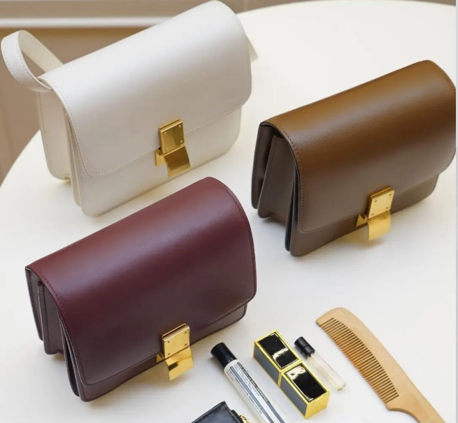
When matching leather goods, do not decide colors based on feeling, but comprehensively consider factors such as the color of the leather, the background, connotation, and exterior of the leather goods, to find your own reasons for choosing a particular color.
When matching leather goods, express what you want to express through colors, such as “sweet,” “cute,” or “steady,” which emotional adjectives can convey this feeling. When using colors, consider the user’s age and personality…… It will be more inspiring.

No comments yet